UMA BRAND WEBSIT
uma.com website design
UMA BRAND WEBSIT
uma.com website design
BACKGROUND
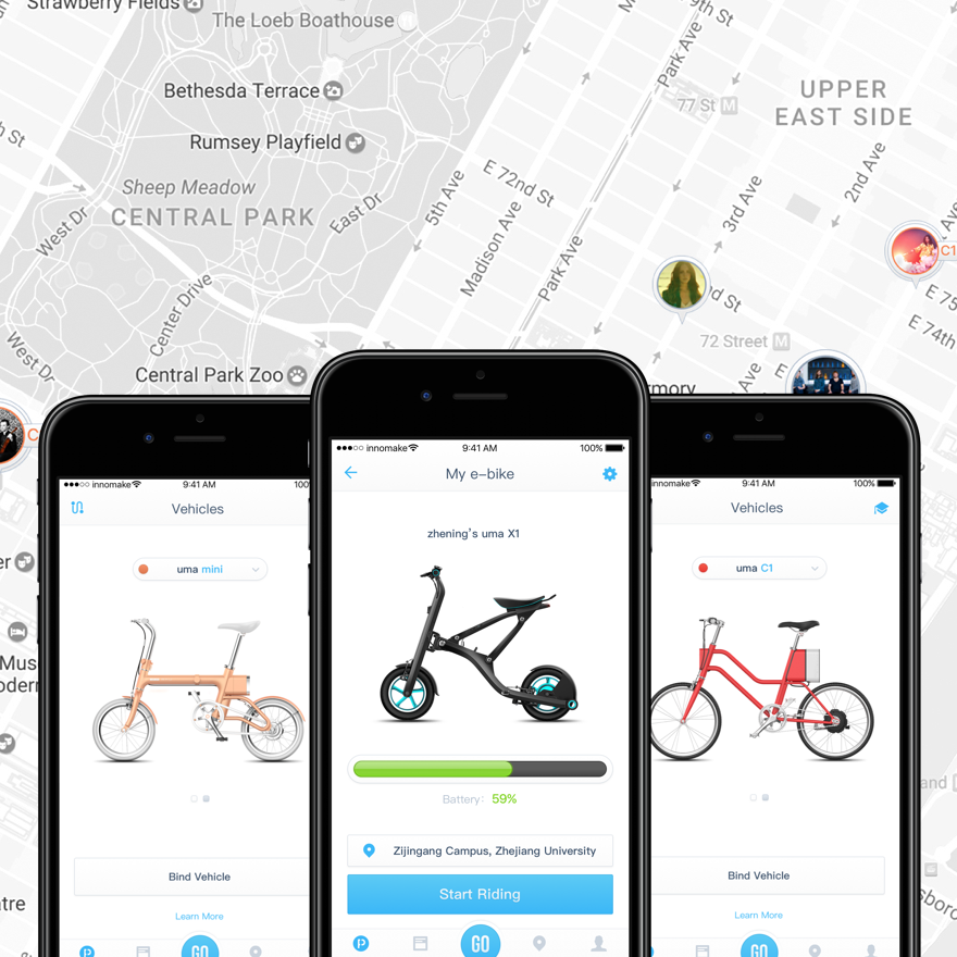
UMA.COM as an important part of brand building. UMA is the acronym of Urban Mobile Actor, which demonstrates our hope of people travelling freely in the city and enjoy riding bicycle. It is the mainly value as existing products display, team introduction and official ordering channel. So that more people can understand the products concept and corporate culture.
This project started from our startup team found, it is just a team introduction website when we have no product. With the continuous release of the products, the content gradually improved. We founded the uma brand for e-bike in July 2016, the site officially changed its name to uma.com. Brand tone is young, dynamic and fashion, we injected the brand concept into the website design.
DESIGN PROCESS
In the course of this project, I am responsible for plan the information architecture, content material refinement, interactive logic combing and project coordination management. The user interface designed by another ui designer in the team.
Information Architecture
I made the following thinking for the different target users browsing the website to set up information architecture better:
Ordinary consumers, who is the most important crowd. They want to know the product features, prices, and purchase. They can be converted directly to the purchaser.
Purchaser who brought the uma e-bike, access to product instruction and after-sales maintenance information.
Media and market operations stakeholders, who concerned about the company's development information and product brand concept, to seek the appropriate mode of cooperation.
Who want to join the uma team, understand the team atmosphere and view career information.
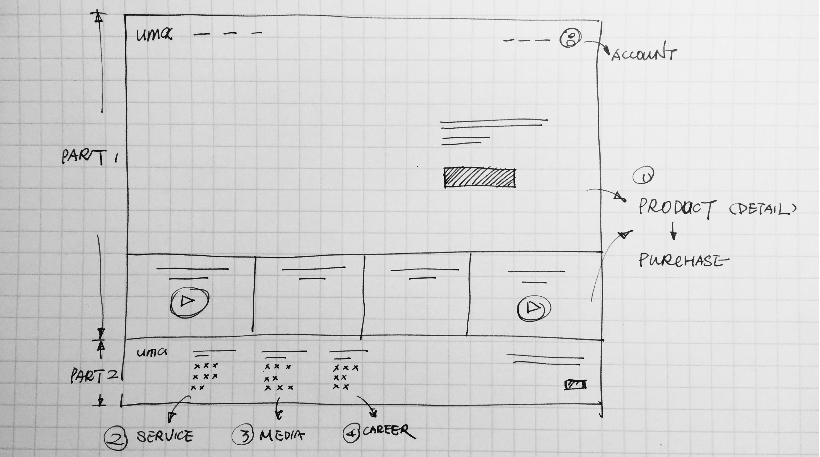

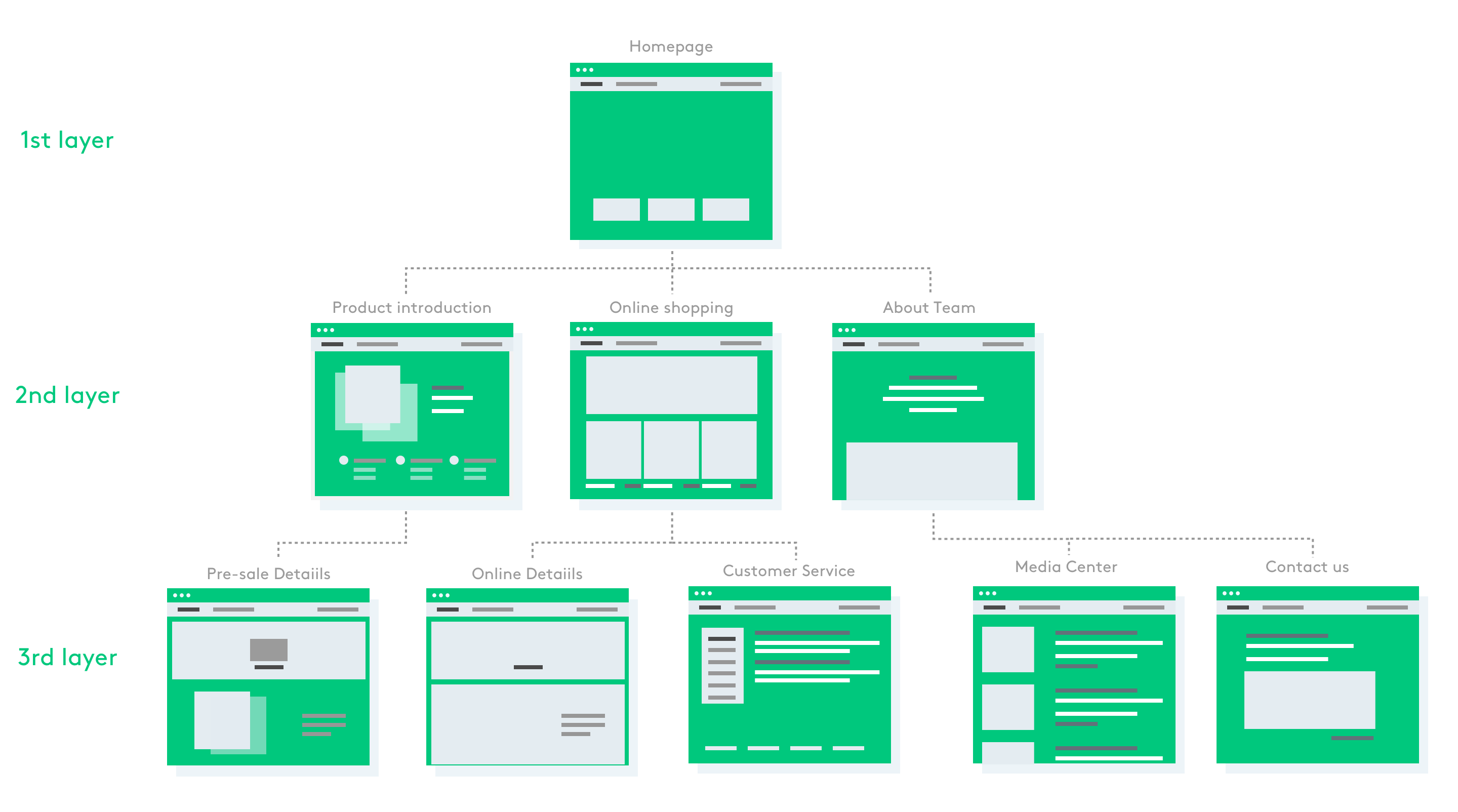
UMA.COM followed the pyramid principle structure, which any layer is the core information overview of next layer, the next layer is the details of the content expansion. It can help users obtain key and effective information while they stay in the page for a limited time.
- 1st layer: When users enter the homepage and their core need is to know more about the uma e-bikes, so that homepage banner is the golden position to show the design intention for brand building and attract the users to click. Now it is displaying the existing uma e-bikes, upcoming new product and pre-saleannouncements. On the other hand, some related informations about shipping instructions, customer service and business cooperation we weakened placed in the bottom of the footer navigation.
- 2nd layer: It displays product details including design, power, intelligence and parameters. App function introduction and download entry. Products list on online mall.
- 3rd layer: Pre-sale product information submitted and order product details page on mall.

Interaction Design
1. Navigation bar
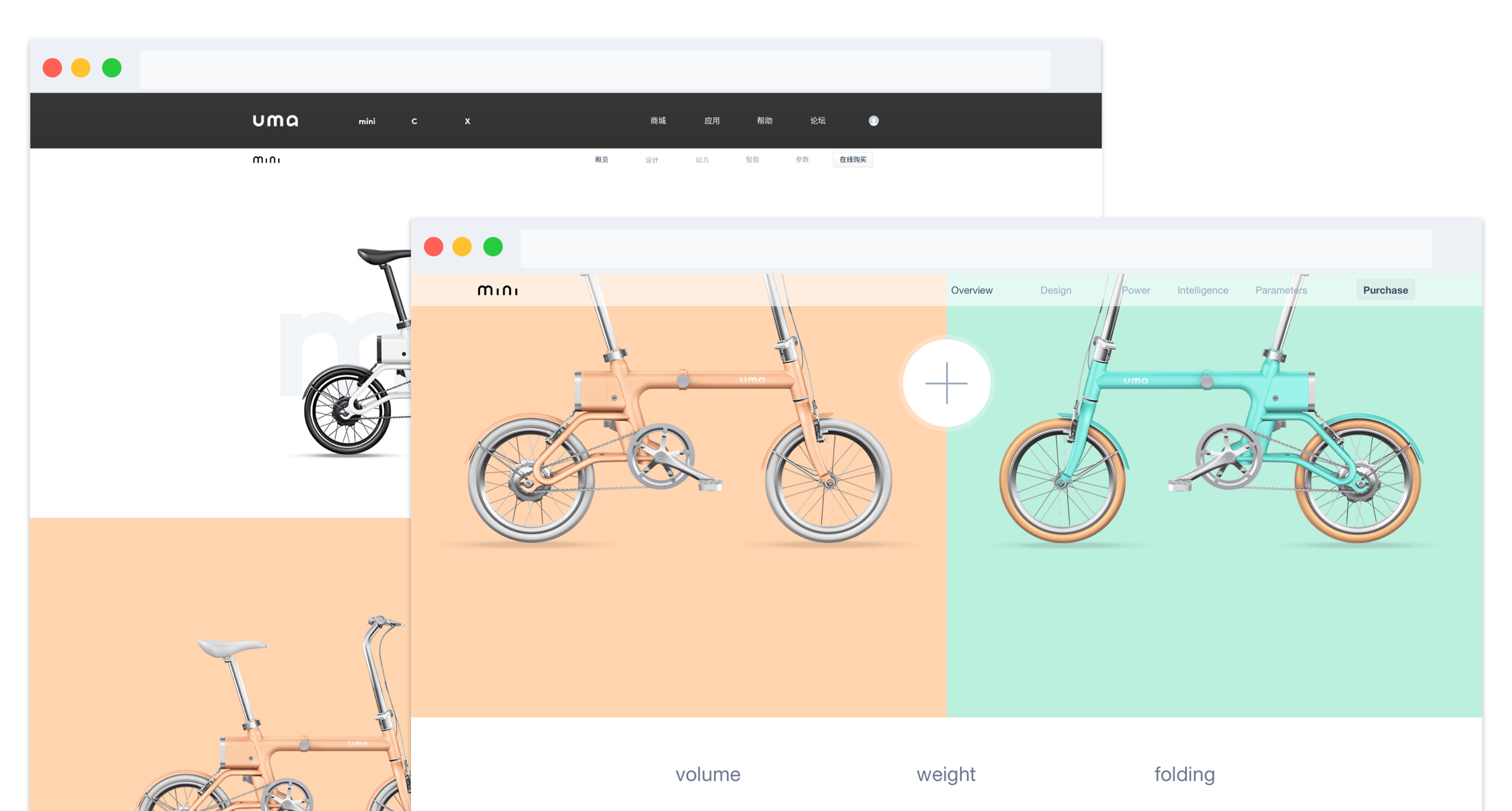
The global navigation of the website is mainly the entry of existing products X1, C1, mini and APP, appear in every page, so that users can easily jump quickly on any page. As secondary navigation in product details page, it is freezing the top when the page scrolled up/down, prompting the user to learn more product information. Switch to the mobile platform, it is collapsed.

2. Motion design
There are two folding e-bikes of uma. I designed the dynamic interaction to show the function so that user will feel better. As the product detail page of uma mini, user can sliding the mouse around to see how the e-bike folding clearly.
3. Parallac Scrolling
App function displayed by parallax rolling effect, allowing users to browse the page process more coherent, access to information more accurate.
Content Material Refinement
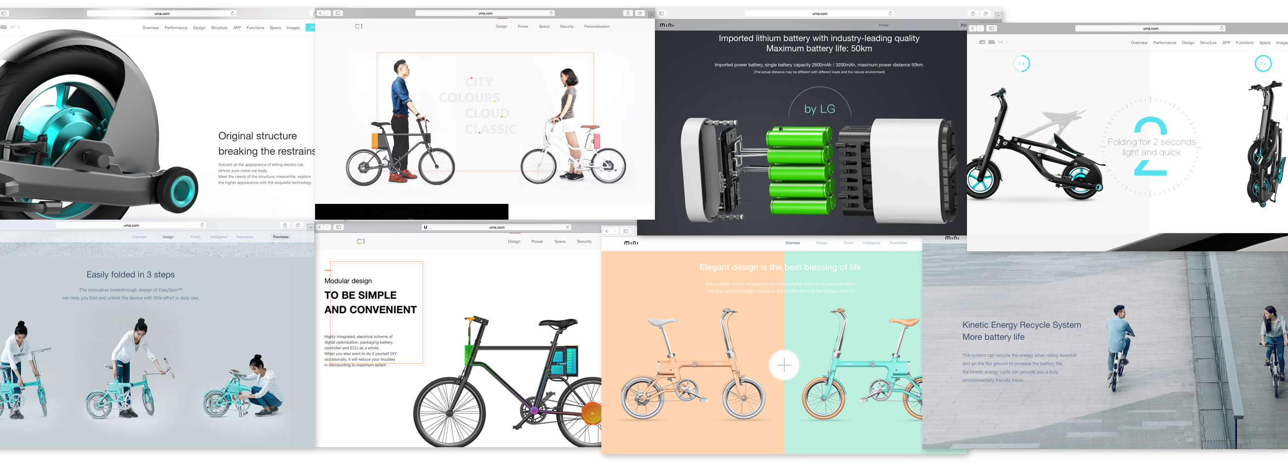
Product brand website is the most important function is displayed close to the real product, to stimulate the user's desire to buy, thus contributing to the purchase, complete the transaction. In the process of refining this content, I worked with ID designer and market operators to refine the product's selling points, design ideas and product features. I combined with 3D rendering pictures, live scenes of real scenes, as well as video, to show users a multi-angle understanding of the product.

User Interface Design
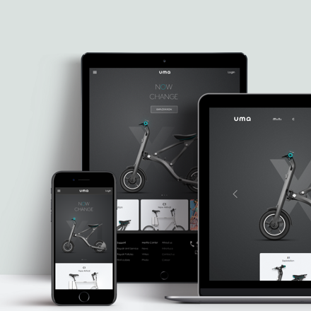
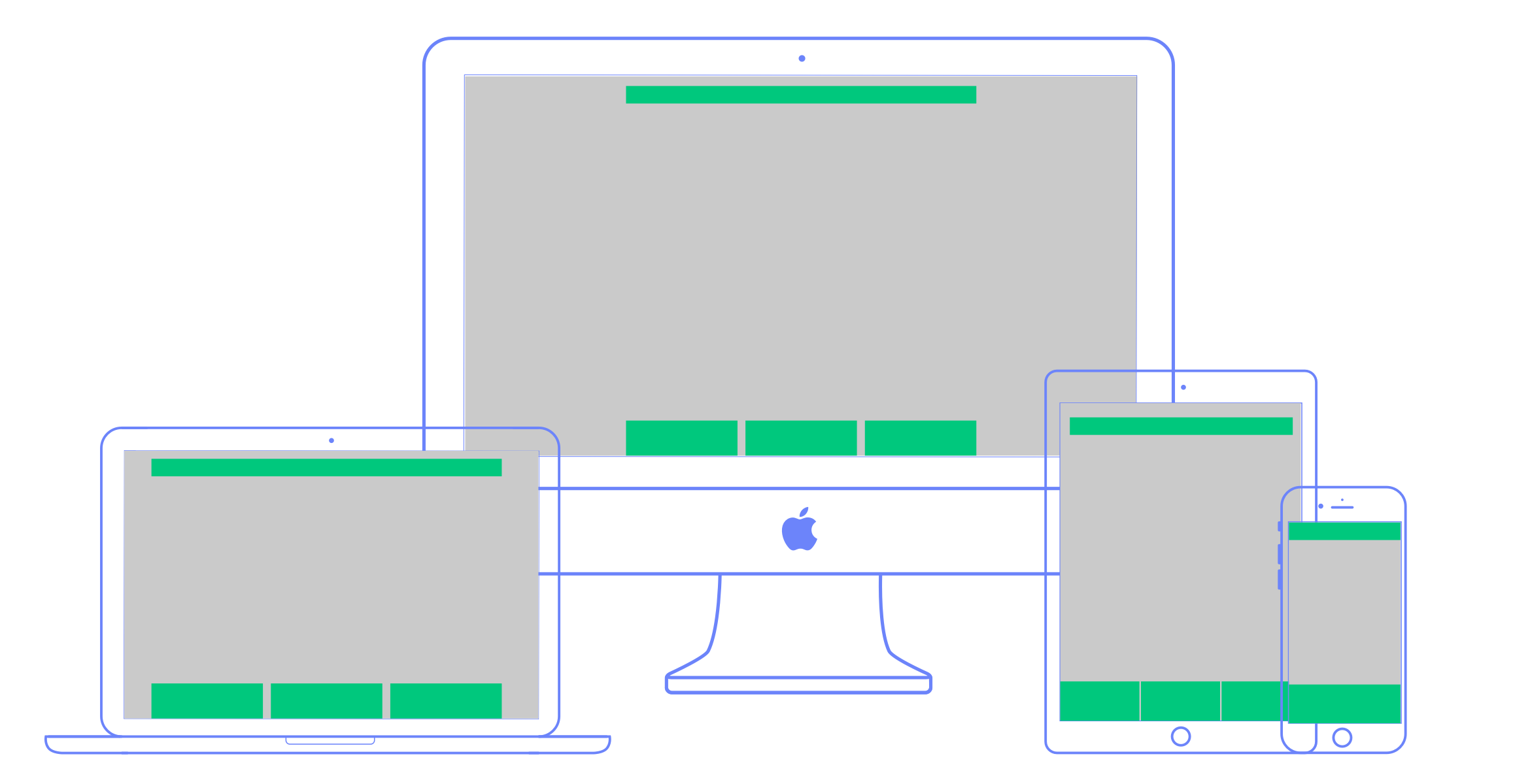
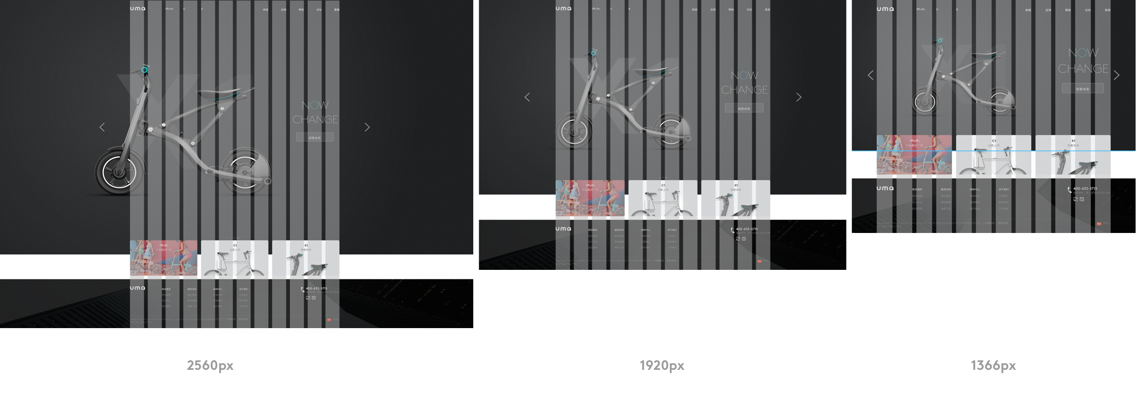
Grid system can improve the efficiency of ui design and multi-platform responsive flexibility. According to the latest display resolution data show, PC mainstream resolution has reached 1366 * 768px. I discussed with ui designer and we use this as the web side of the minimum page size, set the width of the main content display area 1120px. And then through the responsive web design, adapt to different devices, such as ipad, iphone, to ensure consistency of the visual experience.


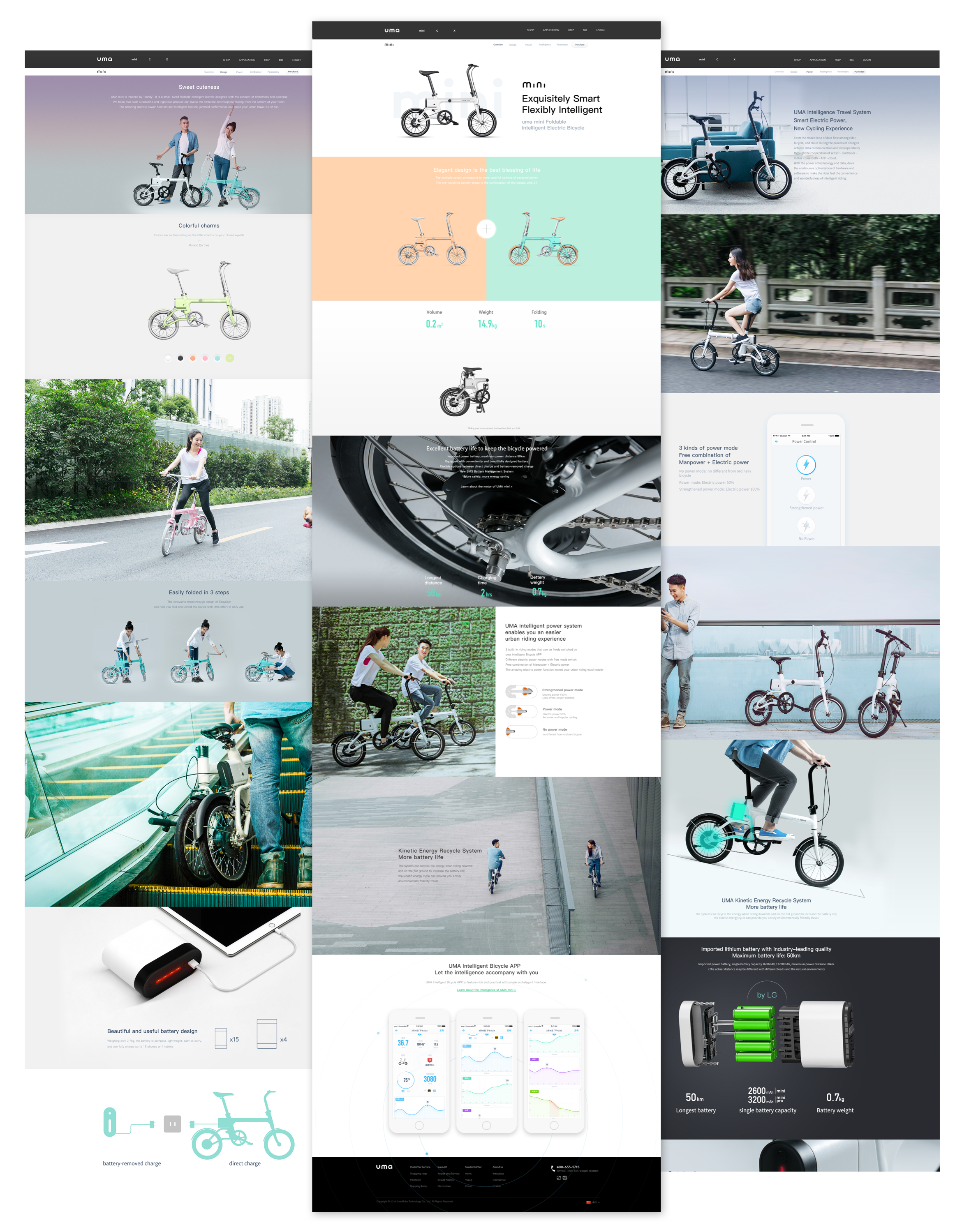
The overall page of the website visual style adhering to the brand concept that is bright, dynamic, young. At the same time, combined with the design features of the product, make a subtle distinction of design. The following is the product page of the uma mini, the others can be found at uma.com.
