Project Overview
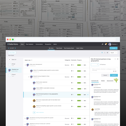
This project focuses on the UX improvement of the key task flow of updating goals on the BetterWorks platform. It is a designer-led project without a PM. I collaborated with another designer throughout the entire design process including user research, problem definition, design exploration, prototype testing, design iterations and more. Moreover, we engaged stakeholders and the executive team in the discussion process.
Duration
2 months
Role
UX/UI designer
Tool
Paper sketch, Sketch 3, InVision
Deliverables
Paper prototypes, Interactive prototype, Hi-Fi Mocks, SPEC, Project summary report
Project background
BetterWorks is a cloud-based human capital management software that allows employees to create Objectives and Key Results (OKRs) and link them to top company goals. Managers and employees establish goals in BetterWorks and then track them over a period to make an organization more open and transparent. Everyone can see what’s happening with goals and leave comments for communication across the organization.
Goal progress update and commenting is the key task in the Goals module. Most users check-in on progress on a weekly or monthly basis. Today, the ambiguous definition of the update concept and the inconsistent UIs can confuse users.
The goal of this project is to improve the experience of the key task flow to be more clear, intuitive, efficient, and consistent. Thus, increasing the usage and reducing the number of relevant support tickets and the complaints in NPS.
Research for understanding the problems
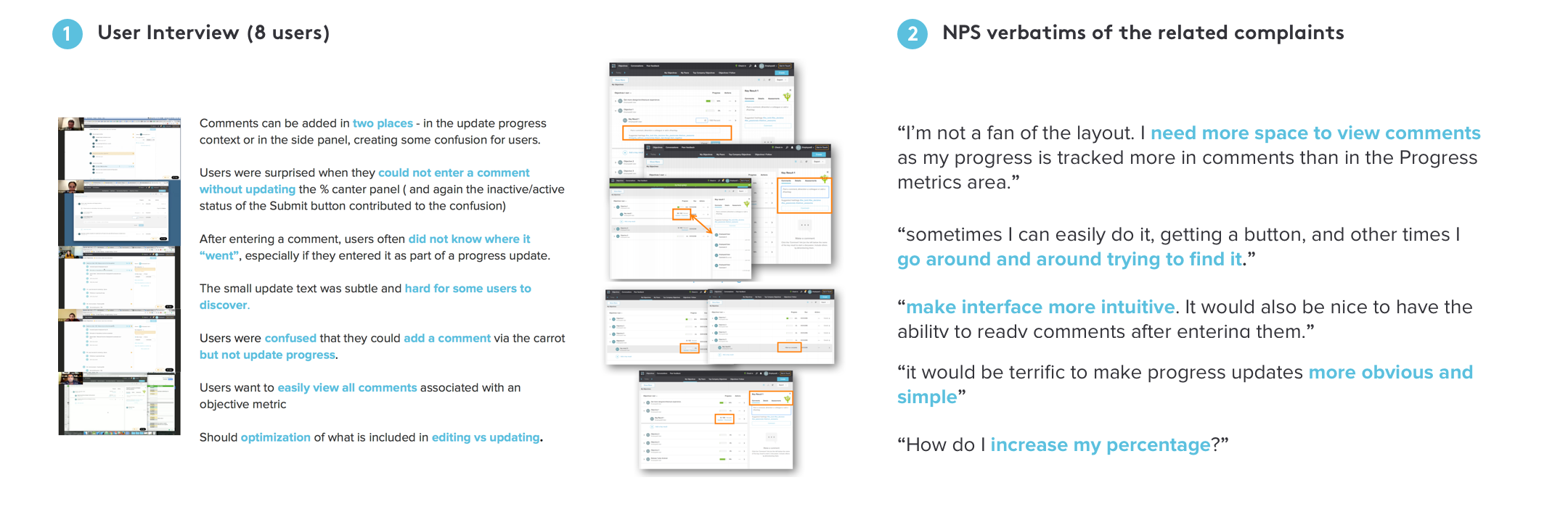
We have multiple channels to receive user feedback. In our Slack channel, we gather insights from the cross-functional teams at BetterWorks, who share their comments on their own experience as well as transfer the feedback from the customers to us. In addition, we also label and summarize complaints via Zendesk and NPS vendors as the direct feedback channel. For this project, we collected all the mentions related to the progress updating and commenting experience. In addition, I conducted 1:1 interview sessions to understand our users' current workflows and pain points.

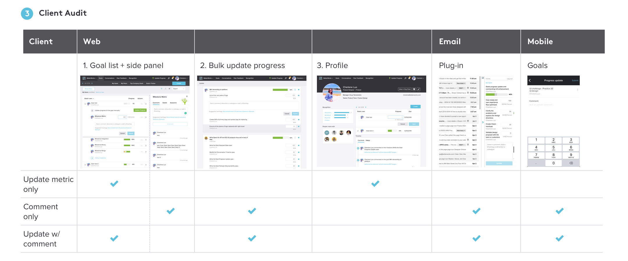
Aside from qualitative research, we also did audited and analyzed data on web and mobile clients. The main takeaway is that there were multiple inconsistent ways for user to complete the progress update task, as shown below:

Problem analysis and definition
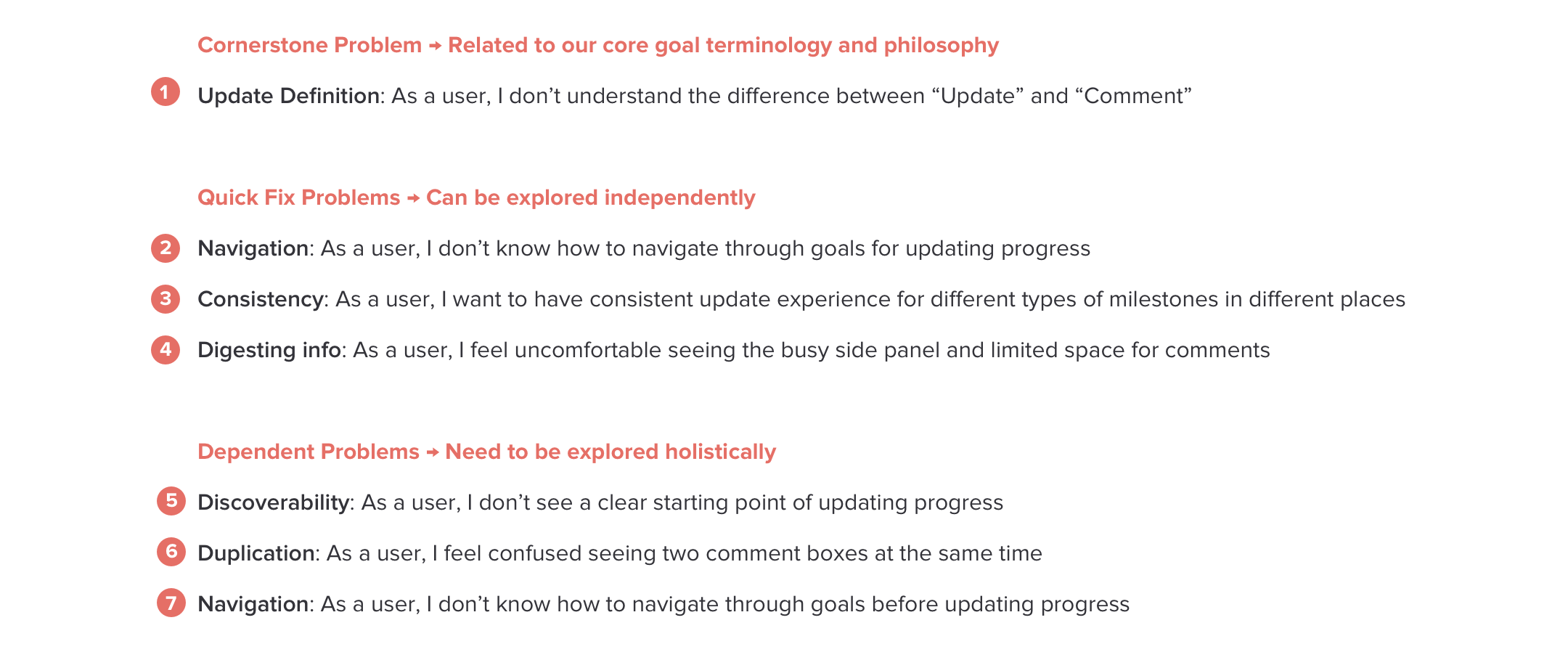
According to the research, we categorized the problems into 3 types:


Problem-solving design process
Cornerstone Problem: Related to our core goal terminology and philosophy
For “Update” definition, previously, users only can submit metric number update with the contextual comment or only submit metric number update. They can not only submit a contextual comment without metric number update. But they can do that on the right panel.
We redefined the concept of the “Update”, which is following the OKRs best practice. Users can update in three ways in one place.
BEFORE


New Definition


Quick fix problems: Can be explored independently
For navigation, it is showing the shadow for row selected state now. It is not noticeable and the shadow on the list since it implies a nested or parent-children structure. So we used consistent visual and comment pattern for making selected state obvious.
For consistency, it shows different UIs for different types of milestone and goals. Today, users can’t submit contextual comment for the type of binary or integrated milestone. So we created the component of updating UIs.
For digesting info, it shows information pretty busy on comment input field and wastes many places of comment history on the right panel currently. We cleaned up suggestion hashtags and comment feeds for digesting info more efficient.
BEFORE


AFTER


Dependent problems: Need to be explored holistically
Design explorations
Based on the problems in the analysis, we explored the proposals respectively. Moreover, since some problems are highly dependent, we also consolidated the ideas into the integrated design directions. Here are the four paper prototypes for the direction validation.
BEFORE
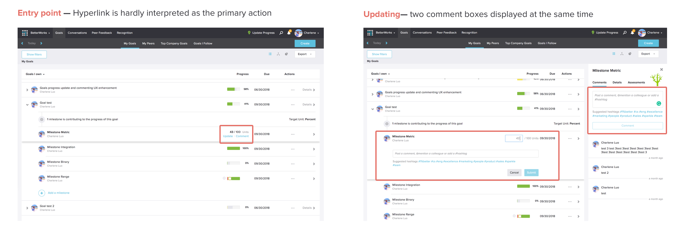

PROPOSALS: 4 Directions


Round 1 paper prototype user testing
We conducted the user testing with the paper prototypes both internally and externally including an onsite session at Evernote. Seven Users went through the same tasks of the goal progress updating and commenting with each prototypes. During the process, we moderated the conversations to help them think aloud. At the end, they provided their preference order of the four directions. In term of results, most users preferred direction A and C.


Iteration: 2 directions
As the learning from this round of user testing, users preferred A and C because of having only one place to do one thing. However, we also recognized two types of users. One type is that the user preferred inline lightweight experience, and only want to see comment history when necessary. The another type is that the user like update one thing with comment history at a time. The reason why they like A or C.
Initially, I planned to reduce the entry points by removing the existing bulk “Update progress” page. Since only 10% of users visited the “Update Progress” page according to the data I found. To my surprise, users really like this flat list with lightweight experience and declared the expectation of not taking it away. It services users who want to easily update multiple milestones at once. So we combined the bulk update page into direction C. Meanwhile, we iterated A and C to Hi-Fi prototypes for round 2 user testing.
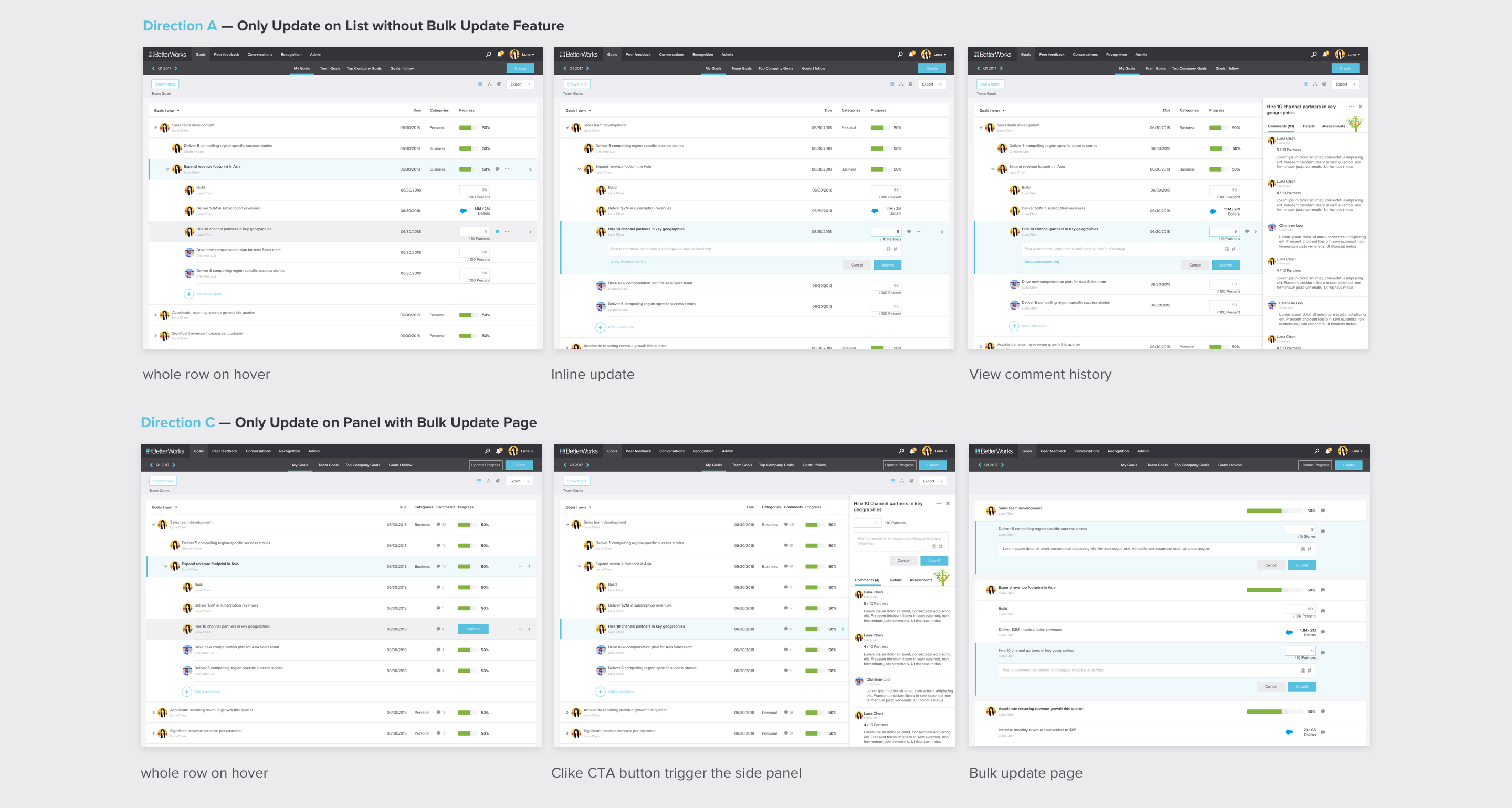

Round 2 Hi-Fi prototype user testing
We conducted 50 minutes 1:1 onsite session with 6 participants from INTUIT in one day. They have different roles, such as an individual contributor, a manager, or an HR. They have different experiences and use flows using BetterWorks platform as well.
The session was split into 2 parts: 1. Key task flow walkthrough 2. Comparison analysis on four specific areas of the design:
Entry point: Inline field VS “Update” button
Progress update: Inline update VS Panel update
Comment: Action icon VS Expose comment column
Bulk update: Same page experience VS New page experience


In the Round 2 user testing, most users preferred the direction C. They consider it more intuitive and discoverable than today so that they easily find the starting point and complete the task efficiently.
Finalize the holistic proposal and deliver
Based on direction C, we did some finishing touches and evolved it into the final proposal. Additionally, we summarized the design process with the design rationale to share with the CS and the ENG team for gathering the final feedback. Along the way, we also discussed with PM and engineer on the estimation of the cost and adjusted the scope of MVP accordingly.
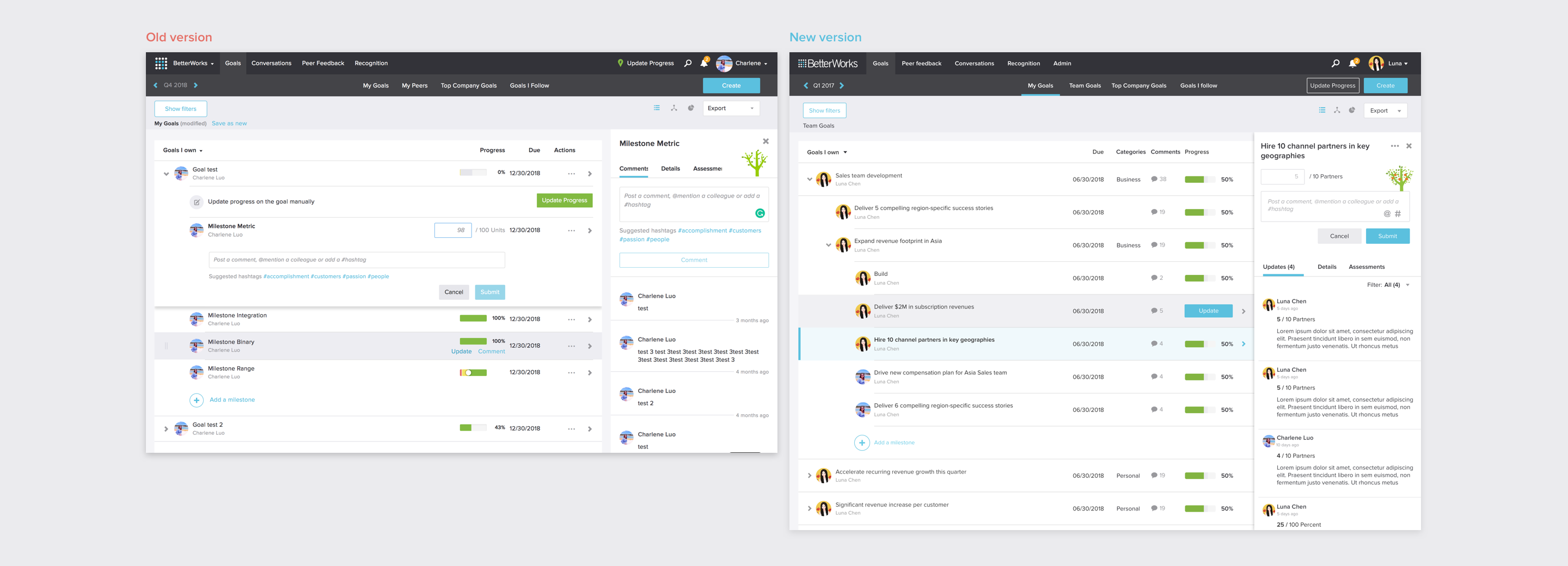

What I’ve learned
The final proposal looks simple while the design process is not simple. We have faced different kinds of constraints and the intertwined dependency. Here is the summary of what I’ve learned:
Brainstorm more ideas in different directions first instead of generating only various layouts of the same idea.
Think holistically. An integrated proposal can possibly satisfy multiple use cases well.
Make a comparison of the specific areas across different proposals. It helps dive deep into users’ rationale behind their overall choice.
